« Microsoft's Art Collection | Main | 520 Traffic Mess »
June 18, 2007
One-Page Slide Decks
In February I took a class called "Advanced Presentation Design" from a professor at Catholic University named Andrew Abela. Abela teaches a method of presentation design called "Extreme Presentation", and in fact has a blog of the same name. Extreme Presentation is roughly as "extreme" as Extreme Programming, but it makes a snappy name (the phrase "Extreme Blogging", for some mysterious reason, only gets about 1000 hits on the Web).Abela teaches a 10-step process about how to design your presentation, which I won't get into here (I understand he is writing a book about it). It's an interesting approach, but the really fascinating part of his class is the number of slides he recommends creating for a presentation. The number he recommends is "as few as you can possibly have", and according to him the ideal slide deck would have a single slide with everything on it. So you are thinking WTF, how can the audience see that? Which brings me to his REAL point: in almost every presentation situation, per Abela, you should NOT be presenting from a projected slide deck: you should be presenting from a printed slide deck.
He described there being two types of presentation styles: Ballroom and Conference Room. The Ballroom style is where you are presenting to a large room, primarily one-way, to inform and entertain (see Wedding, You Are The Best Man At A). For this, although he wants you to go through the 10 steps, he basically falls back on the Beyond Bullet Points advice: little text, use diagrams and photos and all that, one slide per minute or thereabouts (he’s not actually against bullet points per se, if they work in context).
The Conference Room style is where you are presenting to a smaller audience, in a two-way interactive dialogue, and you want to engage people or persuade them to change behavior. This is Abela’s real passion. Here he wants as few slides as possible (ideally one), with as much detail as possible (he claims you really can’t have too much detail). Only go to multiple slides if it just won’t fit on one. AND PRINT IT OUT. Forget projecting the slides, they are too dense. Don’t view them on your laptop either, the printed page gives you much better contrast (as Edward Tufte has pointed out). Print out the slide, walk the audience through it, and discuss. If your slides pass the “squint test” (where the slide looks like what it is trying to communicate--easier to see than explain, go to Abela's blog for examples), then the audience will grok their overall meaning at first glance, and won’t be scared by the detail. He also commented that if you do this, people will be looking down at the slide, not at you, so you can literally be reading from a prepared script as you guide them, and they won’t notice. Also this makes controversial subjects easier to discuss because it feels more like a gathering of equals instead of a presenter and an audience.
Abela said that 95% of presentations should be done in the Conference Room style, but instead 95% are done in the Ballroom style. And he really feels that the Conference Room style is the way to go if you are going to convince someone of something.
In our EE courses we are definitely about the convincing and teaching part, not the wedding slide show thing. So it would seem to make sense to try this style. We have some courses that are perfect candidates: a series we teach for more senior developers at Microsoft, which meet once a week for 90 minutes at a time. We already have only 5 or 6 slides for the half hour, so I took a shot at converting one of these classes ("Development at Microsoft for Expert Developers", to be precise) to the Extreme Presentation style: one slide per week, printed and handed out. Here is one of the slides (for week 2 out of 5), fuzzed out to avoid leaking confidential MS info:
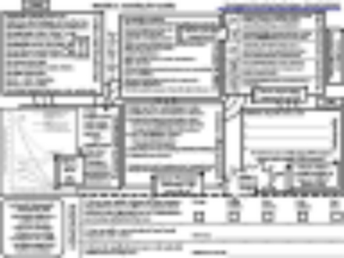
The topic that week was "Standing for Quality", and I set up the slide as "the road to quality" (GET IT?), where each box is linked by a little bit of road, which might be hard to see. If you see that I think it passes the squint test reasonably well. It better, because a lot of the test is 8 point type, so it looks a bit daunting at first glance. The part at the bottom of the slide is homework that we assign the students to do each week in between classes. So they get the slide and the homework in one place; they can take notes on the slides if they want, and I imagine people carefully saving their copies each week for future reference (I have a vivid imagination).
I've taught 4 of the 5 weeks so far and I think the course is going better than it has in the past, in that the students seem more engaged and are having better discussions. One advantage of having everything on one slide is that you can range around the slide at will, talking about what interests the students and jumping to another topic if the conversation flows naturally to it. We haven't finished the course so the students haven't submitted their evaluations yet, but I'm hopeful they will be positive (or more positive than usual, to be precise).
 Which reminds me, if you work at Microshmoo and you want to see some pretty good examples of graphical design, go to [our internal IT site with "/epe" appended"] and look at the Everyday Productivity Education site that you get redirected to. These are prepared guides on various topics related to productivity, computer setup, new employee orientation, security, remote access, meetings, and whatnot (the guide on whatnot is particularly oh never mind). These are really well done and they have pictures of everything, so when it says "click here in Outlook" it shows you the actual menu you are clicking on. Worth checking out if you've got the cardkey.
Posted by AdamBa at June 18, 2007 09:10 PM
Trackback Pings
TrackBack URL for this entry:
http://proudlyserving.com/cgi-bin/mt-tb.cgi/590
Comments
Hi Adam,
Could you please make your slides available internally? I'd like to have a look to understand the technique better.
Thanks, Ziv
Posted by: Ziv Caspi at June 19, 2007 08:33 AM
They are already available. Go to the main site for all of our class material (which I will email you if you don't know it), then look in the EngineeringExcellenceforExpertDevelopers subdirectory, the one-page versions have "one page" in the title. Week 5 is not done yet.
- adam
Posted by: Adam Barr at June 19, 2007 11:13 AM